
Brand and Corporate Identity
What should corporate identity design include?
A consistent brand needs clear rules and files for everyday production as well as a logo.
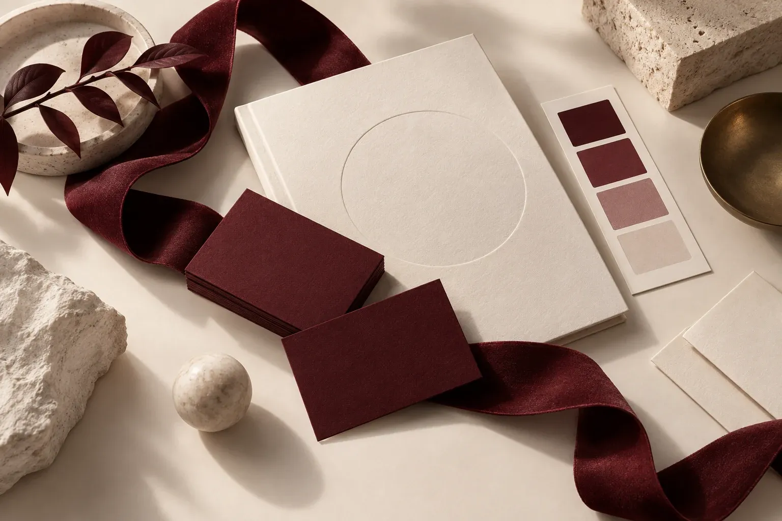
Corporate identity design covers the visual rules that make a brand recognisable and consistent across different settings. The logo sits at the centre, but it is not enough if the website, proposal document and social media posts each speak a different language. A useful identity project creates a system that prevents the team from making the same decisions again for every new material.
Identify the places where the identity will be used
Before design begins, list where the brand will appear. For a corporate service business, presentations, proposals, email signatures and the website may be priorities. For a product brand, packaging, labels and point-of-sale materials become more important. Not every business needs a corporate identity package of the same size.
Separate the list into items used today and those needed soon. This lets you invest in the elements that affect everyday communication rather than materials that will never be used. The design scope and deliverables also become clear at this stage.
Define the logo’s application rules
Alongside the logo file, include light and dark background applications, a single-colour version, a minimum size and clear space. A symbol on a small screen and the full logo in a large area can meet different needs. These versions should be approved parts of the design, rather than redrawn by the person applying it.
State the purpose of each file at handover. A scalable vector for the web, a suitable image for presentations and a file verified with the print supplier serve separate needs. Delivering only screenshots makes later applications harder.
Test colour and typography with real content
Define backgrounds, text colours and supporting tones as well as the primary colour. Explain how screen and print values should be used, and proof important print jobs. Very pale text or low-contrast buttons can weaken a stylish palette in everyday use.
When choosing typography, consider Turkish characters, long headings, numbers and small screens together. Include fonts for web, presentations and office documents, along with the required licensing conditions, in the deliverables. If the same font cannot be used everywhere, specify an approved alternative.
Make digital templates part of the identity
Prepare a few flexible templates for social media cards, blog covers and presentation pages. Do not build the visual language around colour alone: photography, icon style, spacing and heading layouts also create consistency. The continuity of experience emphasised in the USWDS design principles offers a useful reference for assessing digital applications.
Evaluate images created with generative AI by the same rules. An image can be new, but random changes in lighting, tone and composition from one post to the next make brand coherence harder.
Complete handover with a practical trial
For example, ask a new team member to prepare a proposal cover and social media visual using the delivered files. If they constantly need to ask the designer questions, the guide may be incomplete. Keeping the current files in one place and assigning responsibility is as valuable as the design itself. You can build your corporate identity with Tigur, starting with the touchpoints your brand actually uses.
Related articles

Social Media and Content
How to build a social media content strategy
For regular publishing to create value, each item needs a clear audience and a decision it supports.
Web and E-Commerce Solutions
Speed and usability on a mobile-friendly website
Mobile friendliness goes beyond fitting a page onto a small screen. Visitors need to complete their main task comfortably.